Photograph your kitchen
Stand back so a good stretch of worktop is in frame, and use daylight if you can. An ordinary phone photo is perfect — a bit of everyday clutter is usually fine.
Free kitchen worktop visualiser
Upload one photo of your kitchen and watch a new worktop appear on your actual worktop run, in your kitchen's own light. Compare quartz, granite and marble-effect looks on your own photo in seconds — free, right here in your browser.
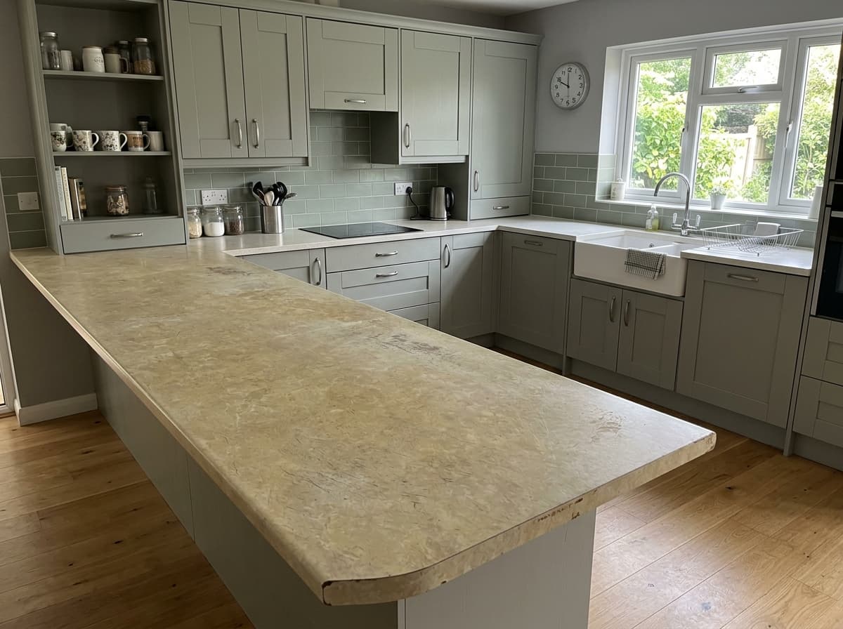
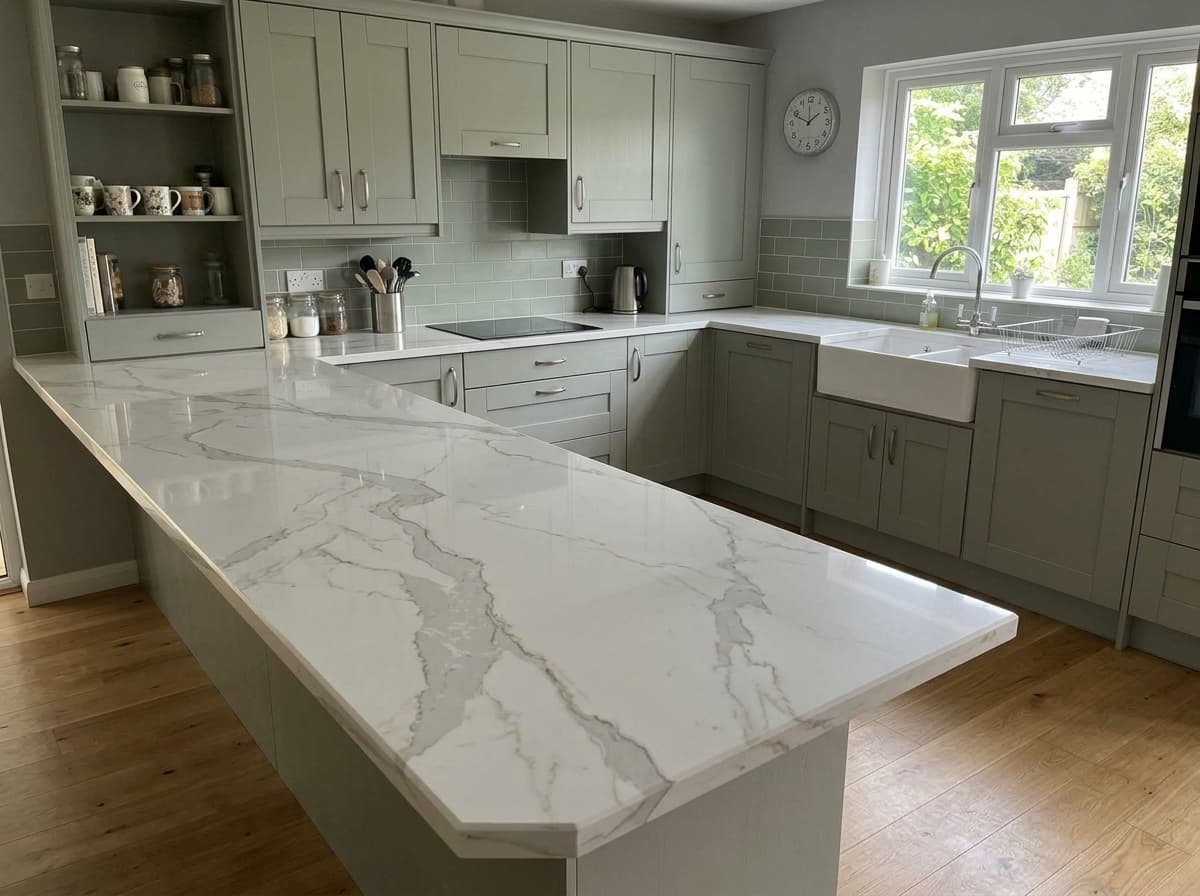
Real before & afters
Every pair is a real customer photo and the preview the visualiser made from it.
 Before
 After
After Before
 After
After Before
 After
After Before
 After
After Before
 After
After Before
 After
AfterHow this works
Why it matters
A little square can't show how veining flows across a three-metre run, or how a colour reads next to your cabinets and floor. That's why 'loved the sample, disappointed at the fitting' threads exist.
Under bright, even showroom lights every worktop looks its best. Your kitchen has real daylight, warm bulbs and shadows — the same finish can read completely differently at home.
The AI worktop visualiser works on a photo of your actual kitchen, so you judge colour, contrast and veining in the room itself — before you've spent a penny.
How it works
No app to download, no account, no measuring tape — just your browser and one photo.
Stand back so a good stretch of worktop is in frame, and use daylight if you can. An ordinary phone photo is perfect — a bit of everyday clutter is usually fine.
Pick from the demo range — bright whites, greys, blacks, sparkles and marble-effect looks. Not sure? Try one safe choice and one bold one.
Your new worktop appears in seconds, on your own photo, in your kitchen's real light. Save a few favourites, show the family, then order samples of just your shortlist.
Which colour suits your kitchen?
Too dark? Too clinical? Too dated? The questions people agonise over on forums are usually settled by two renders of your own kitchen.
Worried plain white looks clinical? It depends on your units and light. Preview a stark white next to a soft-veined warm white and see which one your kitchen wants.
The go-to pairing for sage, navy and wood cabinets. Render a light grey and a charcoal on your photo to settle the 'lighter or darker than the units?' debate for good.
Black worktops divide opinion — dramatic to some, heavy or dated to others. See one in your kitchen's real light before you commit either way.
Mirror-fleck finishes are impossible to judge from a swatch photo. At full scale across your own worktop run, you'll know in seconds whether the sparkle is you.
The Pinterest favourite — and the one where cheap patterns give themselves away. Check the veining at room scale against your actual cabinets, not from a thumbnail.
Speckled granite, greens, creams and blues for kitchens that don't want safe. Try the colour you secretly love next to the sensible option.
Why it’s different
If you've tried a worktop visualiser before, you probably ended up decorating a pre-built showroom kitchen. This one is different: real AI, working on a photo of yours.
You pick cabinet styles from a menu and never see your own room — so the preview can't answer whether the worktop suits your kitchen.
The counter gets tinted one flat, uniform colour — no veining flow, no shadow, nothing that behaves like real stone.
Some big-brand visualisers still tell you to come back on a laptop. Your worktop decision shouldn't have to wait for one.
No rebuilt scenes and no stock kitchens — the preview starts from your own photo, aiming to change the worktop and nothing else.
Perspective, shadows and reflections come from your photo, so the result reads like a photograph of your kitchen — not a mock-up.
Snap, tap, see — right in your browser. Stand in your kitchen and try worktops in the room you're changing.
For worktop businesses
Everything on this page runs on VisualiseO — the visualiser widget fabricators, showrooms and stone retailers put on their own websites, loaded with their own range.
Load your own slabs and finishes so every render a visitor makes is a product you can actually quote, template and fit.
Someone uploading their kitchen photo is actively choosing a worktop. Being the site where they saw it in their home puts you first in line for the job.
Run it on a tablet at the counter: photograph the customer's kitchen and swap finishes while they watch. Indecision becomes a shortlist.
It's a widget — add it to your worktop pages with an embed snippet, protected by domain allow-listing and rate limits.
Yes. The visualiser on this page is free to use, with no account and no card details — upload a photo, pick a finish and see the result. It's a live demo of the VisualiseO widget, so the finishes shown are a sample demo range. There's a limit on free previews per visitor; if you want to keep comparing after that, you can buy extra previews from £3, but you never have to.
You don't need one — this AI worktop visualiser runs in the browser on any phone, tablet or laptop. Upload a photo of your kitchen, choose a quartz, granite or marble-effect finish, and the preview appears in seconds. (If you've picked up the American term, it's a free countertop visualizer too.)
Stand back so a good run of worktop is visible, hold the phone roughly level, and use daylight if you can. One clear, wide photo beats several close-ups — and you don't need to fully tidy up first, though a clearer worktop gives the AI the best chance of a clean result.
It's very good at the decision that matters at this stage: colour, tone, veining and light-versus-dark, judged in your kitchen's real lighting. It isn't a colour-calibrated substitute for a physical sample, and every screen shows colour slightly differently — so use it to cut thirty options down to two or three, then order samples of the shortlist.
That's exactly the decision the visualiser is built for. The render is designed to keep your doors, handles, tiles and floor as they are and swap only the worktop — so you can check a new surface actually suits the kitchen around it before committing to a worktop-only upgrade.
There's no universal rule — tone-on-tone feels calm, contrast feels dramatic, and lighter tops tend to lift mid-tone units. Rather than take a forum's word for it, render a matching finish and a contrasting one on your own photo and compare; the answer is usually obvious within two renders.
A 10cm swatch can't show how veining flows and repeats across a three-metre run, and home lighting differs from the showroom. The visualiser fills that gap by showing the pattern at full scale in your room — then a physical sample confirms the exact colour and texture before you order.
It's used to generate your preview. The details of how images are handled — and everything else we do with your data — are set out in our privacy policy.
Yes — that's what VisualiseO is. This page is a demo of the widget retailers and fabricators embed on their own sites, showing their own range, with domain allow-listing and rate limits. The widget is a paid subscription for businesses; the free tool on this page is how you and your customers can try the experience first-hand.
VisualiseO is the widget behind this page — put it on your own site or showroom tablet and let customers preview your worktop range in their kitchens.